top of page
M18 Bakery
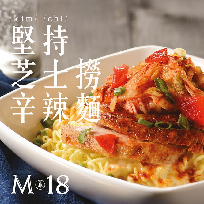
Our client is a new chain of bakery stores that focused on mass estate populations to provide a healthy series of choices. This brand identity is related with a scent and taste of bread, a sound of bell, or even a touch of flour to deliver a fresh feeling of bakery. Those visual elements will bring out a human touched design approach.
Service
Brand Identity
Client
M18 Bakery
Year
2015

Brand Identity
Logo
Name card
Uniform
Packaging

External Communication
Poster
Signage
Interior
Shopfront

Online Communication
Product Promotion
Event Promotion

Photography
Baked goods
Desserts
Cakes
Drinks
bottom of page


